(This is a postmortem for the 26th
[Ludum Dare game programming competition](http://www.ludumdare.com).
The theme was “minimalism” and I wrote
[an HTML5 game called “**::.::::::.**”](http://r-wos.org/hacks/ld26/).)
First things first: the ratings are in:
My entry was placed 60th overall (out of 1610) which is just fantastic!
The other rating categories:
#31  Mood
#54  Graphics
#60  Overall
#121 Theme
#142 Innovation
#190 Fun
#221 Audio
#444 Humor
This time around I focused on making a good game. Which seems a bit like a tautology, but for my first Ludum Dare I mainly focused on surviving the compo and didn’t care that much about the result.
So, this postmortem is different from the last one in that I’ll try to discuss the places where I think I succeeded in making a good game – and, of course, the places where I failed.
Technical
I used the tried and tested HTML5-canvas again, with the game code written in plain old JavaScript. This was a good choice, 48 hours are not enough time to really get into trouble with technical debt – so, the language doesn’t matter, and the programming style doesn’t matter.
What does matter though is that everyone is able to play the game, which is pretty much a given for non-WebGL HTML5 games. You can throw any modern browser at it and it will Just Work, regardless of the OS.
If it wasn’t for Firefox, that is. Firefox 10 (a pretty old version, the latest release is twenty-something) is my main browser, but it’s not usable for games:
-
Every five-or-so seconds the world stops for a garbage collection (at least that’s what I think is what happens). This is a much bigger problem than the fact that FF 10 is overall slower than Chromium. I can react to the predictably worse performance by skipping frames (or lowering the target frame-rate alltogether) but I can’t do anything about a sudden and unpredictable stop of the whole world for a second.
-
In ::.::::::. I sometimes flash the background of the game-embedding page as a kind of ambilight-for-the-poor. A quite subtle effect but surprisingly effective. It’s implemented as a CSS3 transition (that is, the game only changes the body’s background-color and the transition is CSS). In FF 10 this is extremely expensive and (on my machine) drops the game to one or two FPS during the transition.
Unlike the garbage collection thing, this is predictable but I still can’t do anything about it since it’s just too much of a performance drop to fix with frame-skipping.
By the way, FF 10’s gradients/box-shadows and transitions look much better than Chromium’s to me – so it’s not that the extra time it spends for drawing them is completely wasted.
Again, the Firefox I have here is old. My distro’s release cycle has just …well cycled some weeks ago and I’ll have a newer FF version for the next compo – maybe that fixes things.
Visuals
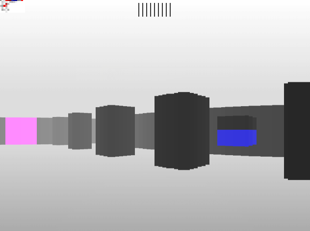
::.::::::. looks much better than any game I have ever written before but it’s still quite a long way from looking great. I am, however, very pleased with the enemy health visualization:

The fish-eye camera effect was well-received, too. This “effect” falls out for free in a raycaster (normally, you would correct the view to avoid it, but I found that leaving it in made the game look more strange and interesting).
However, from playing some LD entries written by people who know what they are doing I found that I need to pay much more attention to visual consistency.
The game doesn’t run at the full resolution of the underlying canvas, but it’s very inconsistent about it: horizontally, “game-pixels” are 8 real pixels big but vertically, a game-pixel is the same as a real pixel. The game also has a limited resolution in the z-direction (the axis that goes “into” the screen) which is extremely unusual and a result of my KISS (here: “Keep It Super-Stupid”) raycaster implementation.
The inconsistency gets worse when shooting since the “focus” effect is a horizontal gradient at the full canvas resolution. Also, the text in the game uses a standard sans-serif font instead of something that makes (visually) sense in terms of the rest of the game’s graphics. This is an extremely big oversight on my part – the game uses a language with only 3 symbols (“.”, “:”, and “|”) – I easily could have drawn those by hand. In retrospect, I really don’t remember why I didn’t do that.
And then there are the colors – well, no, not good. I should have just gone to one of these color theme sites and select a reasonably good theme and be done with it. What I did, instead, was using the usual full-red, full-green, full-blue colors. I’m a bit blind to how ugly that is (not physically blind, only psychologically) – but it’s the first thing I thought when I started playing the other entries: “Oh shit, I fucked up the colors again, didn’t I?”. Yup.
These things seem small and unimportant but it’s exactly that what makes the difference between a polished, good-looking game and – well, the one I turned in. But even with all that I still have place 54 in the graphics category, so it seems that people didn’t mind that much.
Gameplay
The game doesn’t have that many gameplay mechanics, but that’s pretty much expected for a game written in 48 hours. Since “running around and shooting” is the main thing in the game, I focused on making that a fun thing to do.
The subtle things I think I did right:
- Including strafing as a movement (the mother of all raycasters, Wolfenstein 3D, only had rotation). With this, the controls are pretty much like in a gamepad-controlled FPS (e.g. on consoles).
- Deliberately including the strafe-running bug (running while strafing makes you go faster because the strafing vector and the normal-movement vector are independent of each other). This would be awkward on a gamepad but with the keyboard this “bug” means that pressing more movement buttons (e.g. “w” and “d”) makes you move more. Which is physically wrong but somehow feels right (to me).
- Including a “bobbing up-and-down while walking” animation, and a quite strong jitter while shooting. Again, that’s pretty much standard nowadays, but Wolfenstein didn’t do that either.
What I should have done differently:
- I should have included jumping. There’s nothing to jump over in the game world, nor do you ever need to jump to shoot something as the weapon works on a complete screen column (i.e. you only need to target the enemy horizontally, not vertically) but: jumping is fun.
- Some commentators said that the rotation was too slow. I think strafing and strafe-shooting eliminates that problem somewhat, but yes – it could have been a bit faster.
- Also, someone said that a bit of inertia for the movement would have improved things. This is a thing that didn’t even cross my mind when implementing but it absolutely makes sense, now that I think about it. A FPS on a console has analog movement inputs, ::.::::::. only has binary keyboard controls. So, a bit of acceleration based on how long the key has been pressed would have probably made the controls feel more natural.
Things I’m not so sure about:
-
The damage the player inflicts on enemies is not constant, but a fraction of the enemy’s health. The result of this is that the first few hits deal a lot of damage but when the enemy’s health is near zero the hits do nearly no damage at all. I did it deliberately that way – my thought process was:
- The first few hits visibly nearly kill the enemy, which makes the player feel powerful
- But after that, the enemy seems tougher than the player thought, resulting in a “die die die” kind of desperation, with the player shooting on full-auto (which, except for the “player nearly dead” state, is visually and audio-wise the most exciting part of the game).
- And then it makes “boom” and the enemy dies, and everybody is happy.
I’m not entirely sure if that’s what the players actually experienced, or if they just thought “The fuck? There’s a bug in the enemy health visualization here”.
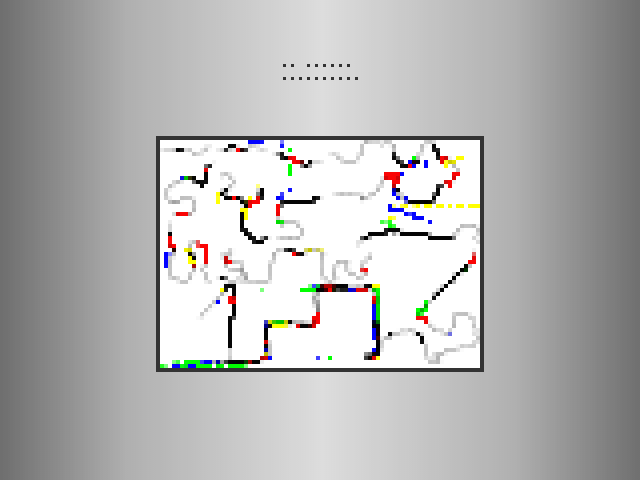
Apart from the obvious “shoot everything that moves” mechanic, there’s the level selection canvas which is a direct result of how the player played the game. Originally, I thought one would be able to draw pictures using this canvas but that turned out to be pretty much impossible – the enemies just move too fast and too randomly for the player to use them as a pen. So that “mechanic” turned out to be more of a gimmick. Which is okay, I think.
Sound
My last LD entry didn’t have sound, but for ::.::::::. I included some sound effects made with the great great great sfxr. And, by golly, did it make a difference! The sound effects are very simple but it’s still much more fun to play with sound. I didn’t expect that, to be honest.
Sfxr is basically a synthesizer but it’s tuned for sounds from the 16-bit-console era. I originally wanted some kind of a looping ragtime-melody as the background music but that turned out to be a) impossible to do with sfxr, and b) too much work to do with other tools. So, I just made some very simple “sine wave + phaser” sound and looped that. This transformed the game from a fun/silly shooter to a slightly frightening bad-trip like experience.
And that got me place 31 in the “mood” category. The power of sound, it’s really astonishing.
I’m pleased with the sound effects, except for the noise the gun makes. It’s a machine-gun like noise, which fits well to the jitter but doesn’t fit to the “shooting focus” gradient thing and the abstract look of the game world. I wanted it to have more like of a continuous “laser weapon” kind of sound, but everything I tried sounded weak and not-at-all dangerous.
The players weren’t that pleased with the sound effects, though – place 221 is pretty bad, considering how well the game did in the other categories. But it was my first game with sound, so that is only more motivation to do better next time.
Technically, the sound effects are small .wav files, using the HTML5 Audio object to load and play them. This worked great, no problems at all (at least on my machine). The machine-gun sound is the result of just hitting .play() every frame, which basically loops it (i.e. it doesn’t do anything if the sound is still playing). Obviously I don’t know if that worked for everyone, but it was a very easy-to-use API.
Overall
I’m quite pleased with ::.::::::.. It’s a small game, but it’s complete
- it has a beginning and an ending, and it’s reasonably fun to play. It’s not as unusual or as creative as it could be but that was more or less deliberate as I tried to focus on quality and polish this time around.
I still have a lot to learn about game development but I think this LD was a step in the right direction. 🙂






Leave a Reply