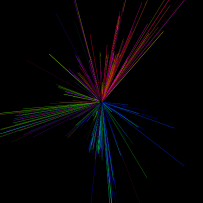
This is a graph of the ping responses of the www sub-domain of all 2-char DNS names for .com, .org, and .net (i.e. www.aa.com, www.ab.com, etc.).
The color and angle of each line is a function of the IP-address, the length is proportional to the response time.

(here’s the script that painted it)
That’s a very important graph of course, highly relevant to basically everything. I know. It’s not too pretty, though.
That’s why I’m currently “working” (can’t call that work, really) on a graph showing tracemap output, that’s more interesting. I want it to look like a city map – and you’d thought that rendering a bunch of edges and nodes to look like a map is a solved problem, but you’d be wrong. I tried to beat grapviz into submission, to no avail. Seems like graphviz can only do ugly stuff.
So now I’m in the midst of writing my own graph layout engine. How did I get here? How come that every time one tries to do something half-way interesting in code one runs into the deepest math tar pits? One minute, programming is like playing with LEGOs – and before you know it you find yourself in a situation where you would have to disprove the Halting Problem and de-construct and re-assemble the universe in order for your approach to work. Computers are strange.
Fun, but strange.


Leave a Reply